Responsive design moved beyond “breakpoints at 768/1024.” Modern CSS lets components adapt to their container, not just the viewport. Combine container queries, subgrid, and fluid typography to ship layouts that scale cleanly without brittle utility piles or JS hacks.
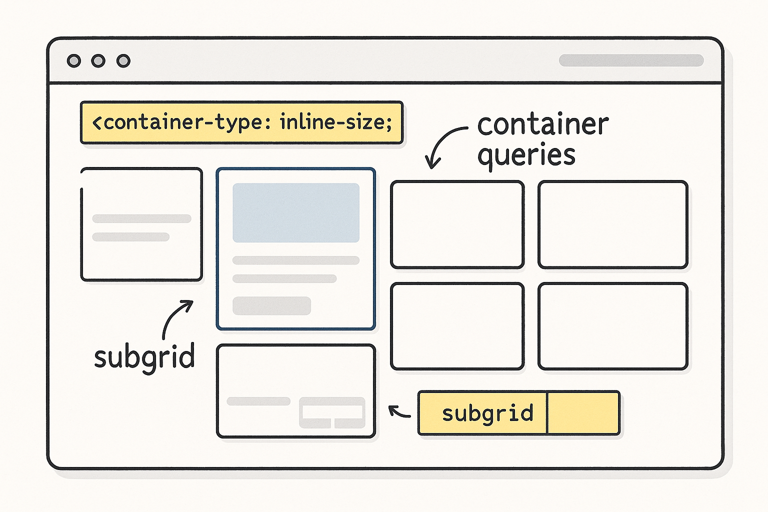
1) Core Idea: Components Respond to Their Box
Traditional media queries react to the viewport. But card carousels inside a narrow sidebar and the same cards in a wide hero both see the same viewport and can’t adapt correctly. Container queries fix that by allowing styles to change based on the size of a parent container.
Setup
/* Declare a query container */
.section {
  container-type: inline-size; /* reacts to width */
  container-name: section;
}
Use
/* Style a component based on its container width */
@container section (width > 48rem) {
  .card-grid { grid-template-columns: repeat(3, 1fr); }
}

@container section (width <= 48rem) {
  .card-grid { grid-template-columns: 1fr; }
}
Result: the same component behaves differently in a sidebar vs a full-width section—without touching global breakpoints.
When to use
- Cards, pricing tables, media blocks that appear in multiple contexts.
- Navigation layouts that compress in narrow sidebars but expand in wide headers.
- Dashboard widgets that change density per panel width.
2) Subgrid: Consistent Alignment Without Wrapper Math
CSS Grid solved many problems, but nested grids often broke alignment (child columns didn’t line up with the parent). Subgrid lets child elements inherit the parent’s track definitions, keeping vertical and horizontal rhythm intact.
Example
/* Parent grid defines columns and rows */
.page {
  display: grid;
  grid-template-columns: 1fr min(70ch, 100%) 1fr;
  grid-template-rows: auto;
  gap: 2rem;
}

/* Article body aligns to parent grid using subgrid */
.article {
  display: grid;
  grid-template-columns: subgrid; /* inherits parent columns */
  grid-column: 2; /* place body in middle column */
  row-gap: 1.25rem;
}

.article-section {
  display: grid;
  grid-template-columns: subgrid; /* headings/media align perfectly */
}
Benefits
- Headings, images, and callouts align across nested sections.
- No duplicate track definitions or fragile calc() spacing.
- Cleaner DOM: fewer wrappers just to “fake” alignment.
3) Fluid Typography with clamp()
Fixed font sizes either feel too small on large screens or too large on small ones. Fluid type scales smoothly using viewport units with min/max guards.
Base scale
:root {
  --step--1: clamp(0.875rem, 0.82rem + 0.25vw, 1rem);
  --step-0:  clamp(1rem,    0.95rem + 0.35vw, 1.125rem);
  --step-1:  clamp(1.25rem, 1.1rem + 0.6vw,   1.5rem);
  --step-2:  clamp(1.5rem,  1.3rem + 1vw,     2rem);
  --step-3:  clamp(2rem,    1.8rem + 1.5vw,   2.75rem);
}

h1 { font-size: var(--step-3); line-height: 1.2; }
h2 { font-size: var(--step-2); line-height: 1.25; }
p  { font-size: var(--step-0); line-height: 1.55; }
small { font-size: var(--step--1); }
Tips
- Use
ch(character) widths andlh(line-height) units for robust typographic rhythm. - Keep body text line length ~60–75 characters for readability.
4) Container Query Units: cqw, cqh, cqi, cqb
Beyond rulesets, you can size elements relative to their container with container query length units.
.card {
  /* padding scales with container’s width */
  padding-inline: 4cqw;  /* 4% of container width */
  padding-block: 3cqh;   /* 3% of container height */
}

/* A hero that’s 40% of its container height, min 240px */
.hero { min-block-size: clamp(240px, 40cqh, 560px); }
This keeps spacing proportional when a component sits in narrow vs wide columns.
5) Practical Patterns
A) Adaptive Card Grid (no global breakpoints)
.cards {
  container-type: inline-size;
  display: grid;
  gap: 1.5rem;
  grid-template-columns: 1fr;
}

/* Grow columns as container allows */
@container (width >= 26rem) { .cards { grid-template-columns: repeat(2, 1fr); } }
@container (width >= 44rem) { .cards { grid-template-columns: repeat(3, 1fr); } }
@container (width >= 64rem) { .cards { grid-template-columns: repeat(4, 1fr); } }
B) Sidebar that auto-condenses
.sidebar { container-type: inline-size; }

.nav-list { display: grid; gap: .5rem; grid-auto-flow: row; }

/* Switch to icon-only when too narrow */
@container (width < 14rem) {
  .nav-item span.label { display: none; } /* keep the icon visible */
  .nav-item { justify-content: center; }
}
C) Media + Text Block with Subgrid
.feature {
  display: grid;
  grid-template-columns: subgrid;
  align-items: start;
}
.feature .media { grid-column: 1 / span 1; }
.feature .copy  { grid-column: 2 / span 1; }
6) Accessibility & Content First
- Reading order: Grid/flex reordering must not break logical DOM order. Screen readers follow DOM, not visuals.
- Contrast & scale: Ensure fluid type doesn’t drop below accessible sizes. Test with user font-size overrides.
- Reduced motion: Animate layout changes lightly; honor
prefers-reduced-motion. Container-driven shifts should not cause jank or unexpected focus jumps.
7) Performance Considerations
- Container queries are efficient, but excessive nesting can add style complexity. Create query containers at meaningful boundaries (sections, cards), not every element.
- Prefer CSS over JS for responsive behavior; eliminate resize observers where container queries suffice.
- Use content-visibility for long lists to skip off-screen rendering:
.section { content-visibility: auto; contain-intrinsic-size: 800px; }
8) Progressive Enhancement Strategy
Most evergreen browsers support these features, but ship safely:
- Baseline layout with simple grid/flex.
- Enhance with container queries via
@supports:
@supports (container-type: inline-size) {
  /* container-query styles here */
}
- Subgrid fallback: If not supported, duplicate minimal grid tracks for children or degrade to a single-column layout.
9) Governance: Tokens and Docs
- Centralize spacing, color, and type tokens; components reference tokens, not raw values.
- Document container thresholds (“cards scale at 26/44/64rem widths”), so designers and engineers have a shared contract.
- Visual regression tests at multiple container widths, not just viewport breakpoints.
10) Quick Checklist
- Major components declare a sensible query container.
- Container thresholds replace most viewport breakpoints.
- Subgrid aligns nested content to the page grid.
- Fluid type with
clamp()across headings and body. - Container units (
cqw,cqh) used for proportional padding and heights. - Accessibility verified with DOM order, focus states, and contrast at all sizes.
- Progressive enhancement via
@supports; fallbacks in place. - RUM monitors CLS/INP after layout shifts.
Closing Thought
Stop teaching components about the viewport and teach them about their own space. With container queries, subgrid, and fluid type, your layouts adapt gracefully anywhere they land—sidebars, cards, or full-bleed heroes—without brittle breakpoint gymnastics.


